Quantcast
Channel: Taps Coogan, Author at The Sounding Line
Viewing all 2165 articles
Browse latest View live

The Leading Causes of Population Change in Every Region of Europe

$
0
0

Submitted by Taps Coogan on the 10th of August 2018 to The Sounding Line.

The following map, from Twitter user NaytaData, shows the primary cause of population growth or shrinkage in nearly every region of Europe between 2012 and 2016. Keep in mind that the map designates the primary factor leading to population changes, not the only factor.

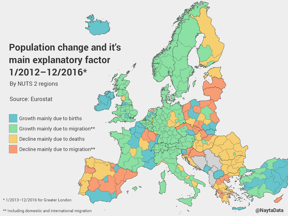
There is not a single region within Norway, Sweden, Finland, Estonia, Latvia, Lithuania, Denmark, Belgium, Germany, Austria, Switzerland, Italy, Croatia, Hungary, Romania, Bulgaria, or Portugal where the population is growing primary as a result of births. Conversely, in every region of the aforementioned countries where the population is growing, it is primarily the result of migration. This migration includes both international migration and domestic migration. Domestic migration occurs when people leave one part of a country for another part of the same country. However, because not a single region of the aforementioned countries (except Latvia and Lithuania which consist of only one region), is seeing population declines primarily due to migration out of the region, it is reasonable to assume that international migration is the primary factor driving population growth in every single growing region of every aforementioned country, not domestic migration.

On the other hand, large portions of Eastern Europe are witnessing population declines due to a combination of emigration and deaths. Meanwhile, Ireland and select regions of France, Spain, the UK, Greece, Poland, and the Czech Republic are seeing population growth as a result of local births.

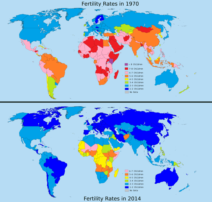
While immigration rates are lower than at their peak in 2015, Europe remains in the midst of the largest influx of immigration since at least the Second World War. To see a visualization of the flow of immigration into Europe, click here.

If you would like to be updated via email when we post a new article, please click here. It’s free and we won’t send any promotional materials. If you found this article interesting, please consider sharing it.

The post The Leading Causes of Population Change in Every Region of Europe appeared first on The Sounding Line.


Map of the Day: Visualizing Meteor Showers

$
0
0

Submitted by Taps Coogan on the 11th of August 2018 to The Sounding Line.

Today’s ‘Map of the Day’ comes from Meteorshowers.org, which creates beautiful visualizations of meteor shows. The maps cannot be embedded here so follow this link or click on the image below to enjoy them.

We are currently in the midst of the biggest meteor shower of the year, the Perseid shower. It peaks August 11th-12th, so if you can find a patch of clear night sky take a look and/or check our the visualization below.

P.S. If you would like to be updated via email when we post a new article, please click here. It’s free and we won’t send any promotional materials.

The post Map of the Day: Visualizing Meteor Showers appeared first on The Sounding Line.

Map of the Day: The Great Turkish War

$
0
0

Submitted by Taps Coogan on the 12th of August 2018 to The Sounding Line.

As part of our ongoing series of historical video-maps, we present ‘The Great Turkish War,’ from Youtube creator Ollie Bye. The following video shows the changing front lines of the Great Turkish War. While not particularly well know today, the Great Turkish War was a critical turning point in Western history and marked the end of Ottoman expansion into Europe. The Battle of Vienna, one of the opening exchanges of the war, is similarly considered one of the most important battles in Western history and the key turning point in the 300 years of conflict between the Holy Roman Empire and the Ottoman Empire.

To see other interesting historical maps check out:
The History of the Greeks
Every Year of the Roman Empire
Every Other Day of the Napoleonic Wars
Every Day of World War I
Every Day of World War II
Everyday of World War II in the Pacific
The History of the World Every Year
The Five Largest Cities Throughout History
Every Major Plague Epidemic in History
The Evolution of Modern Government
The Rise of Religions Throughout History
The History of Communism Since 1850
The History of Urbanization
The History of South America
How the World Got Obese
The History of North America
The History of Africa
The History of China Every Year
Every Nuclear Explosion in History
Every Year in The History of the Ottoman Empire
The History of the Middle East
The Loss of Native American Lands Within the US Every Year
Every Ruler in Europe Since 400 BC
Every Day of the Korean War
The Results of Every US Presidential Election in History
Every Week of the American War of Independence
The Rise and Fall of the Mongol Empire
The Population of Every Civilization in Europe Every Year Since 400 BC
The Rise and Fall of the French Empire
The Rise and Fall of the British Empire
The Rise and Fall of the Spanish Empire
The History of the Reconquista
The History of South Asia

P.S. If you would like to be updated via email when we post a new article, please click here. It’s free and we won’t send any promotional materials.

The post Map of the Day: The Great Turkish War appeared first on The Sounding Line.

Rick Santelli: Tide Is Turning Against Emerging Markets

$
0
0

Submitted by Taps Coogan on the 13th of August 2018 to The Sounding Line.

ACG Analytics analyst Larry McDonald and CNBC’s Rick Santelli recently discussed the emerging financial crisis in Turkey and its growing implications for global markets.

How the collapse of Turkey’s lira affects international markets from CNBC.

Larry McDonald:

“Both the Fed and the ECB have kept interest rates low and easy money for so so long that a country like Turkey has been able to accumulate $250 billion of Dollar and Euro denominated debt. So every 1% move lower in the Lira is like a 5 billion Lira interest coverage problem. In other words, when you have that much dollar denominated debt, it’s lights out. Literally, there is no way that the country can come out of this.”

Rick Santelli:

“I am not sure Turkey can get out of it either. But is that what we are all worried about? No. I think what we are all really worried about is how it affects the big markets, specifically the US market, and I think Larry is absolutely correct. The unintended consequences of bad policy lasting too long from the world’s central banks… it’s going to magnify every credit crack like a powerful microscope and I don’t see anyway around that. But in the bigger picture it doesn’t really feel like ’98 to me. It doesn’t feel like any of those markets to me because back then we wouldn’t have had the luxury to discuss how this crisis would turn out because it was happening in the immediacy of the moment… What does it mean next…? The category I would be worried about most is capital deployment. Emerging markets looked great for all the reasons Larry said, but the tide is turning and bad governance, bad politics in these countries also figures in. But it you were an investor the first thing you do is buy Treasuries, buy Bunds. The second thing you would do is take that cash out and deploy it in solid equity markets. I think this is going to end up being a positive for the US markets, though probably not immediately…”

There is more to the interview so enjoy it above.

P.S. If you would like to be updated via email when we post a new article, please click here. It’s free and we won’t send any promotional materials.

The post Rick Santelli: Tide Is Turning Against Emerging Markets appeared first on The Sounding Line.

Image of the Day: Mission Impossible

Taps Coogan: Looking for Feedback on The Sounding Line

$
0
0

Submitted by Taps Coogan on the 17th of August 2018 to The Sounding Line.

Dear Readers,

As you may have noticed, I have been preoccupied with other affairs for the last few days. While that is keeping me from maintaining the typical schedule of posts here at The Sounding Line, it has also given me a chance to reflect more generally on the site and ponder its future. In that vein, I thought I would pose some questions to you directly:

Why do you read The Sounding Line and what would make it better?

What do you want to see more of or less of? Do you derive more value from the ‘Top News Stories’ or the main articles that I write? Would you like to see more articles with less narrative, more ‘Top News Stories and fewer articles, fewer but more detailed articles, or something else?

I greatly enjoy maintaining The Sounding Line for our readers and would greatly appreciate your sincere feedback. You can leave a comment below, email me at contact(at)thesoundingline.com, or find me on Twitter.

As always, if you would like to be updated via email when we post a new article, please subscribe here. It’s free and we won’t send any promotional materials. Also, if you enjoy The Sounding Line, please consider sharing it with others who might enjoy it as well.

Thank you very much,

Taps Coogan

The post Taps Coogan: Looking for Feedback on The Sounding Line appeared first on The Sounding Line.

How Fertility Rates Have Declined with Rising Wealth Around the World

$
0
0

Submitted by Taps Coogan on the 18th of August 2018 to The Sounding Line.

On a number of occasions here at The Sounding Line, we have discussed the trend of declining fertility rates around the world. Fertility rates have fallen below replacement levels throughout much of Europe, the Americas, and Asia. While fertility rates still remain high in much of Africa, the Middle East, and South Asia, they are declining there too. In fact, as the following map from Reddit user Areat illustrates, compared to the 1970s fertility rates are now lower in every single country on earth.

Via Reddit User Areat

What is driving the global trend of declining fertility? While there are undoubtedly multiple factors behind the trend, the following chart illustrates that increases in economic productivity (often considered a proxy for wealth) have been closely correlated with falling fertility rates, not just in developed economies but around the world.

(If you cannot view the chart click on the title below)

The decline of fertility rates – as we get richer. Animated 1960-2016 [OC] from r/dataisbeautiful

The phenomenon of synchronized global economic growth has been so ubiquitous since at least the 1980s that the term ’emerging markets’ has become the standard descriptor of every country in the world that is not already a ‘developed economy.’

The sharp economic deterioration now being witnessed in Turkey, Argentina, Venezuela, etc…, and the economic slowdown in China points to a possible shift in this dynamic. Unlike during the 2008 financial crisis or previous recent recessions, the current emerging market problems are not strictly cyclical nor part of a synchronized global slowdown. To a greater extent than in recent memory, the current emerging market crises are arising from deterioration in good governance, long term misallocation of capital, and the abandonment of free-market principals. That may point to an end to nearly 40 years of ubiquitous synchronized global growth. It could also point to an inflection point in universal declining global fertility rates.

P.S. If you would like to be updated via email when we post a new article, please click here. It’s free and we won’t send any promotional materials.

The post How Fertility Rates Have Declined with Rising Wealth Around the World appeared first on The Sounding Line.

Map of the Day: Every Other Day of the Russian Civil War

$
0
0

Submitted by Taps Coogan on the 19th of August 2018 to The Sounding Line.

As part of our ongoing series of historical video-maps, we present ‘Every Other Day of the Russian Civil War,’ from Youtube creator EmperorTigerstar, The following video map begins on November 7th 1917, roughly seven months after the the week-long February Revolution which overthrew Tsar Nicholas II and left the country in the control of a Provisional Government established by the Imperialist Parliament (the Duma). The weak Provisional Government and Russian Military was engulfed in near constant strikes, protests, and mutinies, mostly over Russia’s continued participation in World War I. As a result, the Russian Civil War broke out on November 7th 1917. The Russian Civil War pitted the Bolshevik Red Army against the White Army, a loose coalition of imperialists, capitalists, democrats, and anti-democrats. Fighting raged until the White Army’s defeat on June 16th 1923. Now largely forgotten, the United States and the United Kingdom sent several thousand soldiers to Russia in support of the White Army as part of the unsuccessful North Russia Intervention.

To see other interesting historical maps check out:
The History of the Greeks
Every Year of the Roman Empire
Every Other Day of the Napoleonic Wars
Every Day of World War I
Every Day of World War II
Everyday of World War II in the Pacific
The History of the World Every Year
The Five Largest Cities Throughout History
Every Major Plague Epidemic in History
The Evolution of Modern Government
The Rise of Religions Throughout History
The History of Communism Since 1850
The History of Urbanization
The History of South America
How the World Got Obese
The History of North America
The History of Africa
The History of China Every Year
Every Nuclear Explosion in History
Every Year in The History of the Ottoman Empire
The History of the Middle East
The Loss of Native American Lands Within the US Every Year
Every Ruler in Europe Since 400 BC
Every Day of the Korean War
The Results of Every US Presidential Election in History
Every Week of the American War of Independence
The Rise and Fall of the Mongol Empire
The Population of Every Civilization in Europe Every Year Since 400 BC
The Rise and Fall of the French Empire
The Rise and Fall of the British Empire
The Rise and Fall of the Spanish Empire
The History of the Reconquista
The History of South Asia
The Great Turkish War

P.S. If you would like to be updated via email when we post a new article, please click here. It’s free and we won’t send any promotional materials.

The post Map of the Day: Every Other Day of the Russian Civil War appeared first on The Sounding Line.


How India Will Surpass China as the World’s Most Populous Country

$
0
0

Submitted by Taps Coogan on the 20th of August 2018 to The Sounding Line.

The following animated population pyramid, from Twitter user Simon Kuestenmacher, highlights one of the major global demographic shifts currently underway: based on UN population projections, India is set to surpass China as the world’s most populous country.

After decades under China’s now somewhat relaxed ‘One Child‘ policy, China’s fertility rate dropped below two children per woman, the minimum rate required to sustain a stable population. While China’s population is still growing as a result of increased life expectancy, the number of children being born peaked in the early 1970s and the number of working age adults peaked around 2015. As a result, China’s population is expected to begin declining in the mid 2020s. India’s fertility rate remains above two and the number of children being born likely peaked in just the last few years. India’s increasing life expectancy and higher birth rates are expected to keep its population growing until around 2070, when it is projected to be 1.75 billion people. Compared to today, India’s population will increase by an amount equivalent to the entire population of the EU plus Canada (540 million) by 2070.

To see the dynamic ranking of the world’s most populous countries until 2100, read this.

P.S. If you would like to be updated via email when we post a new article, please click here. It’s free and we won’t send any promotional materials.

The post How India Will Surpass China as the World’s Most Populous Country appeared first on The Sounding Line.

Visualizing Facebook’s Domination of the Social Media Universe

$
0
0

Submitted by Taps Coogan on the 22nd of August 2018 to The Sounding Line.

The following infographic, from Visual Capitalist,  puts the massive popularity of the biggest social media platforms in perspective.

Courtesy of: Visual Capitalist
The degree to which Facebook and its subsidiaries (Instagram, WhatsApp, and Messenger) dominate the enormous social media landscape is remarkable . Combined, the four platforms boast six billion monthly active users, compared to just four billion unqiue internet users in the world. While that six billion figures is double, triple, or quadruple counting users who use multiple Facebook platforms, it easily dwarfs all other platforms. Google owned Youtube, which is more video hosting platform than social media site, comes in second place with 1.9 billion monthly active users.
The other notable trend is that of the 21 top social media platforms, only one, UK based Telegram, is from the EU and soon the UK won’t be in the EU.
P.S. If you would like to be updated via email when we post a new article, please click here. It’s free and we won’t send any promotional materials.

The post Visualizing Facebook’s Domination of the Social Media Universe appeared first on The Sounding Line.

The US Is Now in the Longest Bull Market in American History

$
0
0

Submitted by Taps Coogan on the 24th of August 2018 to The Sounding Line.

Wednesday August 22nd, 2018 marked the 3,453rd consecutive day of the current bull market in US equities, officially making it the longest in American history. As the following chart from Statista shows, the current bull market is now ‘older’ than the previous record holder, the 1990’s bull market and Dot-com Bubble.

According to the common definition, a US bull market starts when the S&P 500 rises 20% and continues until it has fallen 20% from any high set set since the initial 20% rise.

Infographic: 2018 Marks the Longest Bull Run | Statista You will find more infographics at Statista

The US economy took longer to recover from the 2008 financial crisis and recession than the stock market. As a result, while the stock market is now already in record bull territory, the economy itself will take until the second half of 2019 to arrive at record territory.

While the unusually long duration of the current bull market is something to celebrate, it has been largely the result of years of the most accomodative monetary policy in history. Record low interest rates and quantitative easing have been great for the declining percentage of Americans that own stocks and other financial assets, but they have also led to a record buildup of debt, particularly by the US federal government. Instead of taking advantage of the ‘good times’ to cut the deficit and get its fiscal house in order for the next recession, the US federal government is now accelerating its deficit spending. While tax cuts and other recent pro-growth economic policies may extend the bull market further, eventually this bull market will end. When it does, tax revenues will collapse and government spending will surge, as they always do during recessions, and today’s trillion-dollar-a-year deficits will look like nothing.

P.S. If you would like to be updated via email when we post a new article, please click here. It’s free and we won’t send any promotional materials.

The post The US Is Now in the Longest Bull Market in American History appeared first on The Sounding Line.

Image of the Day: Westernmost Colossus of the Abu Simbel Temple

Map of the Day: Every Year in the History of the British Isles

$
0
0

Submitted by Taps Coogan on the 26th of August 2018 to The Sounding Line.

As part of our ongoing series of historical video-maps, we present ‘Every Year of the British Isles,’ from Youtube creator Ollie Bye. The following video map begins in 43 AD with the arrival of Roman forces under Emperor Claudius. Over the succeeding decades Roman forces conquered present day England and Whales but repeatedly failed to subdue present day Scotland, resulting in the construction of Hardian’s Wall in 122 AD and the Antonine Wall in 142 AD to defend and demarcate Roman territory. The Antonine Wall represented the farthest north extent of the Roman Empire anywhere in Europe. The Roman occupation of Britain continued until 410 AD, when the declining Roman Empire removed all troops from the island and locals expelled the remaining magistrates. This period was quickly followed by the Saxon invasions and the establishment of a series of Anglo-Saxon Kingdoms such as Mercia and Wessex. The Kingdom of England emerged from these various Anglo-Saxon Kingdoms in 934 AD and united with Scotland in 1707 to form the United Kingdom of Great Britain. It was followed by the United Kingdom of Great Britain and Ireland in 1800 which was succeeded by today’s United Kingdom and Republic of Ireland.

To see other interesting historical maps check out:
The History of the Greeks
Every Year of the Roman Empire
Every Other Day of the Napoleonic Wars
Every Day of World War I
Every Day of World War II
Everyday of World War II in the Pacific
The History of the World Every Year
The Five Largest Cities Throughout History
Every Major Plague Epidemic in History
The Evolution of Modern Government
The Rise of Religions Throughout History
The History of Communism Since 1850
The History of Urbanization
The History of South America
How the World Got Obese
The History of North America
The History of Africa
The History of China Every Year
Every Nuclear Explosion in History
Every Year in The History of the Ottoman Empire
The History of the Middle East
The Loss of Native American Lands Within the US Every Year
Every Ruler in Europe Since 400 BC
Every Day of the Korean War
The Results of Every US Presidential Election in History
Every Week of the American War of Independence
The Rise and Fall of the Mongol Empire
The Population of Every Civilization in Europe Every Year Since 400 BC
The Rise and Fall of the French Empire
The Rise and Fall of the British Empire
The Rise and Fall of the Spanish Empire
The History of the Reconquista
The History of South Asia
The Great Turkish War
Every Other Day of the Russian Civil War

P.S. If you would like to be updated via email when we post a new article, please click here. It’s free and we won’t send any promotional materials.

The post Map of the Day: Every Year in the History of the British Isles appeared first on The Sounding Line.

In the Last 200 Years, Only Two Presidents Have Gained in the House in Their First Midterm Election

$
0
0

Submitted by Taps Coogan on the 27th of August 2018 to The Sounding Line.

With the Republican Party’s first midterm election under President Donald Trump looming in November, it is worth reflecting briefly on the history of presidents’ first midterm elections.

While first term presidents’ parties frequently maintain stable or increased representation in the Senate during their first midterm election, it has been exceedingly rare for presidents to do so in the House of Representatives.

While the first few Presidents in American history all gained seats in the House of Representatives during their first midterm election (Washington through Monroe), in the 200 years since the House General Election of 1818, it has only happened three times.

One of those times, the 1902 general election during Teddy Roosevelt’s first term, featured many newly created House Seats. While Roosevelt’s party (the Republicans) gained some of those new seats, they gained fewer than the Democrats, and as a result, Republican control of the House decreased and the election was considered a defeat for the President’s party.

The only two times in the last 200 years when president’s party actually increased their control in the House during in their first midterm election was under FDR and George W. Bush. FDR’s victory came during the depths of the Great Depression as he rolled out the massively popular New Deal policies and George W. Bush’s win came shortly after the attacks of September 11th.

32 of the 34 presidents since 1818 have lost representation in the House during their first midterm election. Those losses were suffered by Democrats, Republicans, Democrat-Republicans, and Wigs during times of peace and war, prosperity and depression, and regardless of whether the party held a majority in the House, or not.

None of this means that the president’s party necessarily loses its majority in the House (if it has one), and just because something is rare doesn’t mean it can’t happen. Nonetheless, it does mean that there is a strong historical precedent for the president’s party to lose seats in the House during their first term.

P.S. If you would like to be updated via email when we post a new article, please click here. It’s free and we won’t send any promotional materials.

House Election President President’s Party Change in President’s Party’s Seats in House During First Midterm Election
1790 Washington Washington +2
1798 Adams Federalist +3
1802 Jefferson Democrat-Republican +35
1810 Madison Democrat-Republican +13
1818 Monroe Democrat-Republican +15
1826 Adams Democrat-Republican -9
1830 Jackson Democratic -10
1838 Van Buren Democratic -3
1842 Harrison Whig -69
1846 Polk Democratic -30
1850 Taylor Whig -22
1854 Pierce Democratic -75
1858 Buchanan Democratic -35
1862 Lincoln Republican -21
1870 Grant Republican -32
1878 Hayes Republican -4
1882 Garfield Republican -29
1886 Cleveland Democratic -16
1890 Harrison Republican -93
1894 Cleveland Democratic -127
1898 William McKinley Republican -21
1902 Teddy Roosevelt Republican R+9
1910 William Taft Republican -57
1914 Woodrow Wilson Democratic -60
1922 Warren Harding Republican -77
1926 Calvin Coolidge Republican -9
1930 Herbert Hoover Republican -52
1934 Franklin D. Roosevelt Democratic +9
1946 Harry S. Truman Democratic -54
1954 Dwight D. Eisenhower Republican -18
1962 John F. Kennedy Democratic -4
1966 Lyndon B. Johnson Democratic -47
1970 Richard Nixon Republican -12
1974 Gerald Ford Republican -48
1978 Jimmy Carter Democratic -15
1982 Ronald Reagan Republican -26
1990 George H. W. Bush Republican -8
1994 Bill Clinton Democratic -54
2002 George W. Bush Republican +8
2010 Barack Obama Democratic -63


The post In the Last 200 Years, Only Two Presidents Have Gained in the House in Their First Midterm Election appeared first on The Sounding Line.

Charts: Births to Foreign-Born Mothers in Every Region of England and Wales

$
0
0

Submitted by Taps Coogan on the 28th of August 2018 to The Sounding Line.

With elevated levels of immigration remaining a contentious issue across the EU and the UK, it is worth reflecting on some relevant charts and data from the UK’s Office for National Statistics.

As the following chart shows, over a quarter (28.4%) of all births in England and Wales are now from mothers who were born outside the UK, up from 11.7% when record keeping began in 1969. Over a third (33.9%) of children born in England and Wales now have at least one parent who was born outside the UK.

The most common countries of birth for the mothers and fathers of these children are Poland, Pakistan, Romania, and India.

The following map shows the percentage of births to non-UK born mothers for every constituency in England and Wales as of 2017. As the Office for National Statistics notes:

“The English region with the highest percentage of live births to women born outside the UK was London (57.9%); the North East had the lowest (11.4%). London and the North East have consistently had the highest and lowest percentages respectively since 2001. Brent was the local authority of England with the highest percentage of live births born to non-UK-born women (75.7%), while Redcar and Cleveland had the lowest (3.7%)… In Wales, 11.7% of live births were to women born outside the UK in 2017. Of the local authorities in Wales, Cardiff had the highest percentage (27.9%) and Torfaen had the lowest (4.1%)”

The Total Fertility Rate (TFR) of foreign-born mothers remains higher than UK born mothers, though it has decreased to 1.95, the lowest level on record. The number of babies being born to both UK and non-UK born mothers is declining, though more so for UK born mothers. Births to UK born women decreased by 2.7% from 2016 to 2017 versus a 1.7% decrease for non-UK born women.  Of women between the ages of 15 and 44, 23.9% are foreign born.

To view a visualization of immigration into every country in Europe since 2012, click here.

P.S. If you would like to be updated via email when we post a new article, please click here. It’s free and we won’t send any promotional materials.

The post Charts: Births to Foreign-Born Mothers in Every Region of England and Wales appeared first on The Sounding Line.


Map of the Day: International Exports for Every County in the US

$
0
0

Submitted by Taps Coogan on the 29th of August 2018 to The Sounding Line.

In light the current US administration’s attempts to renegotiate the US’s major international trading relations, the following map shows just how important international exports are to every county in the US.

From the Counties Future Lab, the following map shows the dollar value of intentional exports, their rate of growth, their percent of local GDP,  and the number of jobs that they support for every county in the incorporated US. Blue indicates high levels of exports relative to GDP and tan represents lower levels. Click on a county to see specific data.

While international exports represent just under 12% of GDP for the overall US economy, a low number globally, certain county economies are as much as 67% dependent on exports. Generally speaking, the most export dependent counties in the US are major agricultural or energy producing areas. There are particularly high concentrations of very export dependent counties in Nebraska, Iowa, South Dakota, Indiana, Ohio, Alabama, and Texas. A large portion of these counties voted for President Trump, making a successful outcome of trade negotiations economically important for these communities and politically vital for the current administration.

As we have noted on a number of occasions here on The Sounding Line, US exports face higher tariffs at essentially all major US trading partners than vice versa, lending credence to US demands for better market access around the world. While international trade is significantly less important to the overall US economy than it is for virtually all major US trading partners, individual counties in the US, particularly conservative voting counties, are very dependent on international exports. The US may be, in effect, more politically sensitive to outcomes on trade than economically sensitive, making the recent news of a breakthrough on NAFTA negotiations with Mexico all the more important.

P.S. If you would like to be updated via email when we post a new article, please click here. It’s free and we won’t send any promotional materials.

The post Map of the Day: International Exports for Every County in the US appeared first on The Sounding Line.

Taps Coogan: ECB’s Balance Sheet Has Outgrown the Eurozone Three Years Running

$
0
0

Submitted by Taps Coogan on the 30th of August 2018 to The Sounding Line.

The long-heralded end to the European Central Bank’s (ECB) quantitative easing (QE) program is fast arriving. The ECB continues to maintain that it will stop expanding its balance sheet by the end of 2018. Doing so would mark a turning point in nearly a decade of money printing which has reached a stunning level, equivalent to 40% of the Eurozone’s GDP. The ECB’s QE campaign has reached such proportions that it has grown by more than the Eurozone’s GDP for three years running. As the following chart shows, the ECB’s balance sheet grew by several times more than the Eurozone economy in 2015, 2016, and 2017.

ECB Balance Sheet Growth vs Eurozone GDP
Data Source: Eurostat, Federal Reserve

The ECB’s balance sheet is on pace to outgrow the Eurozone economy this year as well, despite the ECB’s plan to end the program this winter. The ECB is insisting that the Eurozone economy is finally strong enough, and inflation high enough, that it can reduce its monetary accommodation and end its QE program. While inflation is accelerating, economic growth is markedly slower than last year. Eurozone GDP in the first two quarters of 2018 has been 0.4%, essentially half the rate seen in 2017. The Eurozone’s inflation rate is not primarily rising due to healthy factors like accelerating economic growth, strengthening consumer confidence (which is the most negative its been in years), or accelerating wage growth (which remains stagnant and below the inflation rate). Inflation is rising as a result of a depreciating currency, declining foreign direct investment, negative interest rates, and excessive money printing at a time when the US monetary base is contracting.

The ECB is not ending QE because it is confident in a strengthening economy but because it is concerned about the prospect for inflation (currently at 2.1%) continuing to rise further above its 2% target. To make matters worse, for years the ECB has been printing money and buying government debt faster than all the governments in the Eurozone have been borrowing, in essence financing 100% of budget deficits in countries such as Italy. If not the ECB, who will lend to the Italian government at very low interest rates amid rising inflation, growing deficits, and increased currency risk while its economic growth remains below 1%? It’s hard to imagine who because no one other than the ECB has been a net buyer of Italian government debt for years.

The unfortunately consequence of years of overly accomatodative monetary policy form the ECB is that it has achieved its long-wished-for goal of 2% inflation for all the wrong reasons.

P.S. If you would like to be updated via email when we post a new article, please click here. It’s free and we won’t send any promotional materials.

The post Taps Coogan: ECB’s Balance Sheet Has Outgrown the Eurozone Three Years Running appeared first on The Sounding Line.

Rick Santelli and Jim Bianco: Yield Curve Inversions Matter

$
0
0

Submitted by Taps Coogan on the 31st of August 2018 to The Sounding Line.

CNBC’s Rick Santelli recently spoke with Bianco Research President Jim Bianco about the looming possibility of a yield curve inversion. As a reminder, every time since at least World War II that the 10-Year to 2-Year yield curve has inverted, a recession has followed. Many are now arguing that ‘this time is different’ and that an inversion would not mean recession due to distortions caused by central bank monetary policies over the past decade.

Santelli Exchange: The yield curve as an indicator of future recessions from CNBC.

Jim Bianco:

“Everybody seems to think that (inversion would not signal recession) right now. They’re using the excuses of term premium, which means that the 10-Year yield is too low. I think they are sadly mistaken. The yield matters a lot. Every cycle when the yield curve inverts, we always make these arguments. In 2006, it was the global savings glut. In 1990, it was the S&L crisis. It was the crowding out theory in 1980. All those times when the yield curve inverted, ‘it didn’t matter’… It does. The yield curve inverting, especially the 10-Year 3-Month curve, means that money is too tight. It doesn’t matter what the inflation rate (is). It means that money is too tight. The 10-Year 3-Month curve is 75 basis points. It’s still got a ways to go. But if it inverts, that’s a problem and there’s no other way to sugar-coat that.”

Rick Santelli:

“… Why is the curve in danger of inverting?… Who is responsible?”

Jim Bianco:

“The Federal Reserve… The natural state of an economy is expansion. When we have recessions something breaks it. The leading cause of it breaking: too tight Federal Reserve policy. A signal that your policy is too tight: your yield curve is inverting…”

Rick Santelli:

“You are making the argument that the way to normalize isn’t raising rates, it’s a reduction of the balance sheet.”

Jim Bianco:

“That’s exactly where I am going. If I was Federal Reserve Chairman, I’d stop raising. I’d say look at that bloated balance sheet.”

There is more to the interview, so enjoy it above.

P.S. If you would like to be updated via email when we post a new article, please click here. It’s free and we won’t send any promotional materials.

The post Rick Santelli and Jim Bianco: Yield Curve Inversions Matter appeared first on The Sounding Line.

Image of the Day: NASA’s Apollo 11 Mission

$
0
0

Submitted by Taps Coogan on the 1st of September 2018 to The Sounding Line.

The following image artfully details the flight path and stages of NASA’s Apollo 11 mission, the first mission to land humans on the Moon.

P.S. If you would like to be updated via email when we post a new article, please click here. It’s free and we won’t send any promotional materials.

The post Image of the Day: NASA’s Apollo 11 Mission appeared first on The Sounding Line.

Map of the Day: Visualizing US and Russian Arms Sales Since 1950

$
0
0

Submitted by Taps Coogan on the 2nd of September 2018 to The Sounding Line.

The following video, from cartographer Will Geary, shows the stunning volume and destination of competing arms sales from the US and Russia (alternatively the USSR) every year since 1950.

Enjoy:

Arms Sales: USA vs Russia from Will Geary on Vimeo. (Note that the music is via the video’s creator, not me)

P.S. If you would like to be updated via email when we post a new article, please click here. It’s free and we won’t send any promotional materials.

The post Map of the Day: Visualizing US and Russian Arms Sales Since 1950 appeared first on The Sounding Line.

Viewing all 2165 articles
Browse latest View live


Latest Images