Submitted by Taps Coogan on the 18th of September 2018 to The Sounding Line.
This being the ten year anniversary of the 2008 Financial Crisis, financial writers are waxing poetic about how much (or little) has changed in the past decade. Most analyses point to the actions of the Federal Reserve and other central banks as having ‘saved’ the global economy from certain doom.
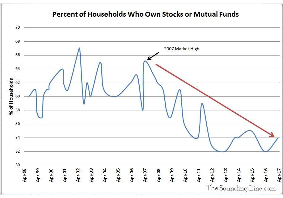
Underlying the Federal Reserve’s unprecedented response to the 2008 Financial Crisis, is the idea of the ‘wealth effect.’ The wealth effect is the theory that rising financial asset prices creates wealth that encourages consumer spending and that increased consumer spending stimulates the economy, creating self sustaining broad-based economic growth.
It is a fallacy. It is a fallacy not because rising financial assets don’t create wealth, but because the way the Fed induces rising asset prices causes other countervailing effects.
The Fed induced rising asset prices by keeping short and long term interest rates artificially low for nearly a decade after the US economy had emerged from the 2008 recession. The result was a migration of capital into higher risk assets, creating a strong bull market in stocks and lower quality bonds. Investors with a significant allocation to risk assets have made tremendous gains since 2009. Unfortunately, a declining percentage of Americans actually own significant quantities of risk assets.
Data Source: Gallup
Middle and lower income Americans spend virtually all of their income. Nearly every extra dollar of income in the hands of an average American gets spent in its entirety. Wealthy Americans spend less of their income. They have larger savings. A smaller portion of every dollar of extra income in the hands of a wealthy American gets spent.
Trying to stimulate the economy by depriving the majority of Americans of interest income on their modest savings in the bank in order to provide extra income for wealthy Americans who will save a large portion of that extra income doesn’t work, and it didn’t. It led to the largest division of wealth since the Great Depression and a decade of below average economic growth.
American households (and non-profits) had roughly $8.2 trillion in bank deposits, savings, and money market funds at the start of 2009, more than they held in stocks and mutual funds combined ($7.4 trillion). Between 1971 and 2009, Americans earned an average of about 6.6% interest on 3-month CDs at the bank. During the period of the Fed’s ‘Zero interest Rate Policy’ (ZIRP), these very same people earned less than 0.35% on the same instrument. That means that the 92% of Americans with bank accounts lost roughly 6% interest a year on their savings because the Fed held interest rates artificially lower. Average yearly returns on the S&P 500 rose roughly 4.6% from 10.5% before the crisis to 15.11% during the period of the Fed’s zero interest rate policy.
In other words, the Fed reduced interest income on savings accounts by 6% in order to boost stock gains by roughly 5% at a time when more Americans had more money in savings than than they did in stocks. The extra gains in stocks since 2009 have come at the expense of interest income, which would have been enjoyed by a broader portion of the population who would have spent a greater portion of the income.
There is a role for the Fed to play in helping the economy recover from financial crises. There are reasons to keep interest rates low during recessions (stimulate credit growth, reduce corporate bankruptcies, etc…). The wealth effect is not one of them.
There have been as many as 42 recessions and five depressions in the US since the 1780s. The US economy recovered from every single one, returning to growth within an average of roughly one and a half years. That includes the 39 recessions and depressions that proceeded the establishment of the Federal Reserve in 1913, and the 20 that occurred when the US had no central bank at all.
The US economy and other free market economies recover from recessions. The US economy would have recovered from the 2008 financial crisis, Fed stimulus or not. That is not to say that the Fed’s actions during the actual recession did not have an effect, or that they did not have any positive effects. It is to say that suppressing interest rates for nearly a decade after the recession had passed for the explicit purpose of driving up stock prices did not create wealth nor economic growth. It simply widened the wealth gap.
When the next recession eventually arrives, let’s hope the wealth effect is a mistake that central banks don’t repeat.
If you would like to be updated via email when we post a new article, please click here. It’s free and we won’t send any spam.
Submitted by Taps Coogan on the 19th of September 2018 to The Sounding Line.
Ray Dalio, co-chairman and founder of Bridgewater Associates, recently gave an interview to Bloomberg, to discuss his new book ‘A Template for Understanding Big Debt Crises’ (it can be downloaded for free here). Mr. Dalio adds to his recent interview with CNBC and warns about looming social, political, and currency crises in the next ‘inevitable’ economic downturn.
Mr. Dalio on the next economic downturn:
“The (next) downturn will be very different than the one in 2008. It will be one in which, I think, the social and political problems will be great because of that wealth gap and populism and I think there will be more conflict. Right now times are good and we’re sort of at each others throats now. I also worry about the effectiveness of monetary policy in reversing that because monetary policy has interest rates, and we can’t lower interest rates as much, and it has quantitative easing, the purchases of financial assets to push other financial assets out and get liquidity in the system, and that is at its maximum. So when we have a downturn, we’re not going to have (monetary policy) as effective. I also think the downturn… won’t just be debts. It will also be pension obligations, healthcare obligation, unfunded obligations… and I think it will be about us having to sell a lot of treasury bonds to the rest of the world and I think that will also be an issue about two years out. So I would say two years out is when I am worried about”
“I don’t think (the next downturn) is going to be as sharp and severe like (the 2008 crisis). I think it’s more going to grind on… All of these obligations will be a problem to be funded and I think it will be more of… a dollar crisis than a debt crisis… When we have to sell a lot of treasury bonds… and we as Americans will not be able to buy all of those treasury bonds, and if interest rates rise too much, the way it usually works is that that constricts credit. We borrow less and that creates weakness in the economy. So instead, because we’ll sell to foreigners, from a foreign perspective… they care not about inflation, they care about currency depreciation when they look at the interest rate. So if a currency goes down, the bonds become cheaper. I think the Federal Reserve, at that point, will have to print more money to make up for the deficit… and that that will cause a depreciation in the value of the dollar… We have the privileged position of being able to borrow in our own currency because we have the world’s leading reserve currency. I think we are risking that by our finances. In other words borrowing too much.”
There is much more to the interview so enjoy it above.
If you would like to be updated via email when we post a new article, please click here. It’s free and we won’t send any spam.
Submitted by Taps Coogan on the 20th of September 2018 to The Sounding Line.
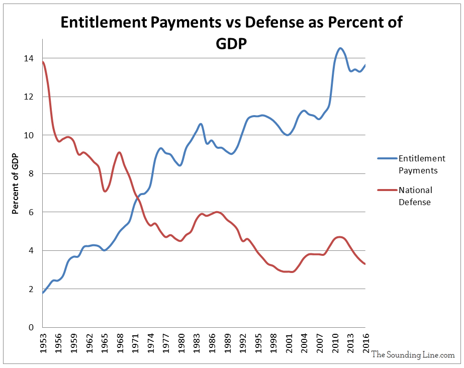
The following graphic, from Will Geary, shows the composition of US federal government spending every year since 1962. Federal spending is broken out into discretionary (military and departments) and mandatory spending (entitlements like Medicare and Social Security). Discretionary spending is set every year by Congress for the various departments and programs of the federal government whereas mandatory spending on programs like Social Security is predetermined based on the nature of various entitlement programs and the number of people qualifying for them at any time.
As the graphic shows, federal spending has grown from $715 billion in 1962 to over $3.6 trillion in 2018. While all forms of federal spending have grown dramatically during that time period, the largest growth has been for mandatory entitlement programs like Social Security and Medicare which now represent roughly 70% of all federal spending. Contrary to popular misconceptions, military spending has actually shrunk relative to other forms of federal spending since the 1960s. In 1962, military spending represented 73% of discretionary spending and 54% of all federal spending. Today it represents 50% of discretionary spending and ‘just’ 15% of total spending total. Military spending has similarly fallen from roughly 9% of US GDP in the early 1960s to 3.5% today. Nonetheless, the US is still the largest military spender in the world by far.
Data Source: Treasury.gov
The large increases in federal spending have led to ever increasing yearly deficits, expected to top $1 trillion in fiscal year 2019 for the first time since 2012, despite years of economic growth and falling unemployment.
If you would like to be updated via email when we post a new article, please click here. It’s free and we won’t send any spam.
Submitted by Taps Coogan on the 20th of September 2018 to The Sounding Line.
The following image, via Kingsly Harvest, is of another hay trolley. Hay trolleys represent some of the first industrial products to emerge after the American Civil War which leveraged the enhanced foundry expertise gained by extensive weapon making. To learn more check out Hay Trolley Heaven.
This 1890 Jones patent hay carrier is one of only six surviving relics of which only three have been restored to operating condition. Designed to work with a hay net this Canadian trolley was approximately twice the size of most American offerings.
If you would like to be updated via email when we post a new article, please click here. It’s free and we won’t send any spam.
Submitted by Taps Coogan on the 21st of September 2018 to The Sounding Line.
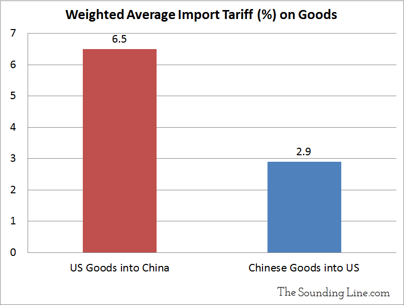
There has been so much back and forth in the trade dispute between the US and China that it has become difficult to maintain perspective on just how much trade is actually being subjected to tariffs. The following graphic from Statista clarifies exactly that.
While both China and the US have now threatened to impose tariffs on virtually all bilateral trade, the US has only applied tariffs on $53 billion of Chinese imports, roughly 10% of imports. Conversely, China has already applied tariffs on $50 billion of US imports, roughly 40% of imports. Coming soon (on September 24th) will be another $200 billion of tariffs recently announced by the US and $60 billion announced by China. Those tariffs, plus US threats to implement another $267 billion in tariffs, will cover virtual all goods traded between China and the US.
Given that all bilateral trade may soon by covered by tariffs, the ‘tariff war’ is fast reaching a point of diminishing returns. While tariffs rates can always be raised higher, US and Chinese buyers are already searching for alternative sources for each-others trade goods. Further raising tariff rates on goods you no longer buy doesn’t have a real world effect.
As we have noted on numerous occasions, because China maintains such an enormous trade surplus with the US, it will always been be the bigger loser in a trade war. Furthermore, Chinese tariffs on US goods are over twice as high as US tariffs on Chinese goods, their regulatory hurdles are far higher, and their theft of intellectual property is rampant.
Data Source: World Bank – World Integrated Trade Solution
Either the situation ‘freezes’ with the US and China keeping prohibitive tariffs on virtually all goods, or a deal is made. Because the US economy and markets are accelerating and the US has legitimate grievances regarding Chinese trade practices, it is hard to imagine the US making concessions to get a deal done. That puts the ball in China’s court.
For now, there have been no serious indications that the Chinese are willing to make substantive concessions. Perhaps they think that the risk to their economic transition into higher value industry is too high. Most likely, they simply think that their economy is big enough to withstand losing its biggest customer. Whatever the reasons, if a deal doesn’t get done before tariffs have been applied to all bilateral trade, it is hard to imagine either side being able to coax the other into a deal afterward.
If you would like to be updated via email when we post a new article, please click here. It’s free and we won’t send any spam.
Submitted by Taps Coogan on the 23rd of September 2018 to The Sounding Line.
As part of our ongoing series of historical video-maps, we present ‘Every Ruler of Russia and Its Borders Since 880,’ from YouTube creator Bulgarian Empire Mapping.The following map shows the rulers and changing borders of the various manifestations of Russian civilization from Olga of Novgorod‘s founding of Keivan Rus in 882 AD until the present day.
Submitted by Taps Coogan on the 24th of September 2018 to The Sounding Line.
Sam Zell, businessman, real-estate mogul, and Chairman of Equity Group Investments, recently spoke with Fox Business News and warned about a growing surge in real-estate supply coming into the market.
Sam Zell:
“I think things are a little frothy and I think they’ve benefited significantly from the fact that there has been a dearth of supply. The dearth of supply is for sure changing (now) and we are seeing very significant new supply in office (real-estate). We’re seeing new supply in multifamily. The flavor of the month is industrial (real-estate) and I do a lot of reading and I always look for idiosyncrasies and one of the peculiar things that I have found is that everybody in the world is building industrial (real-estate). Now I know that Amazon is terrific and I think that they’re a great company but everybody is building industrial? Everywhere? And building it in huge… million, two-million square-foot buildings. I just wonder whether the lack of discipline that marked the real-estate industry in the past is not coming to repeat it… I just have this sense that we have a lot of supply coming on that’s going to effect various parts of real-estate, obviously in different sectors and different time-frames.”
There is much more to the interview so enjoy it above.
If you would like to be updated via email when we post a new article, please click here. It’s free and we won’t send any spam.
Submitted by Taps Coogan on the 25th of September 2018 to The Sounding Line.
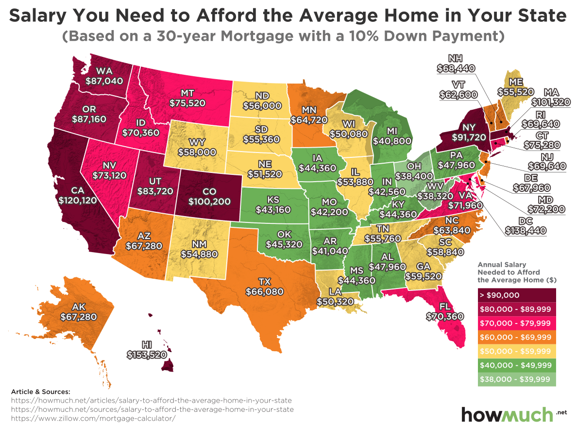
The following map, from HowMuch.net, shows the income needed to afford the average priced home in every state in the US, assuming a 30-year mortgage with a 10% down payment.
The figures were calculated by HowMuch.net by collecting “average home prices for every state from Zillow which we then plugged into a mortgage calculator to figure out monthly payments. Remember, mortgage payments consist of both the principal and the interest for the loan. The interest rate we used varied from 4 to 5% in each state, depending on the market.”
The most expensive average homes in the US are, not too surprisingly, in Hawaii where homeowners need to make $153,520 a year. Hawaii is followed by California at $120,120 and Colorado at $100,200. At the other end of the spectrum, the most affordable homes can be found in America’s ‘Rust Belt:’ West Virginia ($38,320), Ohio ($38,400), and Michigan ($40,800).
As we first noted here and here, over the last several decades the cost and size of the typical American home has grown much faster than typical household incomes. In fact, it takes the median US household nearly twice as many years of work to afford the median house as it did in the 1960s and that median house has grown over 50% in size since the 1980s. That has made home-ownership increasingly burdensome and out-of-reach for millions of middle class Americans.
Data Source: Federal ReserveData Source: Census.gov, Federal Reserve
If you would like to be updated via email when we post a new article, please click here. It’s free and we won’t send any spam.
Submitted by Taps Coogan on the 26th of September 2018 to The Sounding Line.
The former President of the ECB, Jean-Claude Trichet, recently spoke with Bloomberg about his outlook for the global economy and monetary policy, warning of ‘absolutely obvious’ over-leverage that exceeds levels from before the financial crisis.
Mr. Trichet:
“The over leverage is absolutely obvious. Fancy that we are now, in terms of public and private debt outstanding at a global level, at a level which is largely superior to what we had observed at the eve of the last crisis of ’07-’08. So if (debt) is an indicator of a vulnerability that is pertinent, and I trust that it is…, we have… a lot of issues that have to be tackled not only by the central banks. The central banks have done a lot. They were really the only game in town during that period. So I would say governments, parliaments, the private sector, have to be fully aware of the fact that it is profoundly abnormal that we continue to (increase) financial leverage at a global level.”
“Financial markets have a tendency to act and behave on a short term basis. It is very very difficult to incorporate or price in the financial risk of today with what would happen in the medium and long term. Unfortunately we learned that. We know that.”
There is much more to the interview so enjoy it above.
If you would like to be updated via email when we post a new article, please click here. It’s free and we won’t send any spam.
Submitted by Taps Coogan on the 27th of September 2018 to The Sounding Line.
The following graphic, from Reddit user CountZapolai, shows the predominant languages spoken throughout the British Isles since shortly before the Fall of the Roman Empire in 400 AD. While English is the predominant language of the British Isles today, the linguistic history of the Isles is quite convoluted.
Despite much of the British Isles having been under Roman control for hundreds of years, the primary languages of the Isles were still the indigenous Celtic languages at the time of the fall of the Roman Empire. Saxon and Norse invasions thereafter brought English and Norse to the Isles. While Norse failed to take hold, English has gradually displaced most of the native Celtic languages in Britain and Ireland, leaving it the dominant langauge of the UK and Ireland today. Nonetheless, hundreds of thousands of Irish, Welsh, Scottish Gaelic, and Cornish speakers remain to this day.
Reddit user: CountZapolai
If you would like to be updated via email when we post a new article, please click here. It’s free and we won’t send any spam.
Submitted by Taps Coogan on the 28th of September 2018 to The Sounding Line.
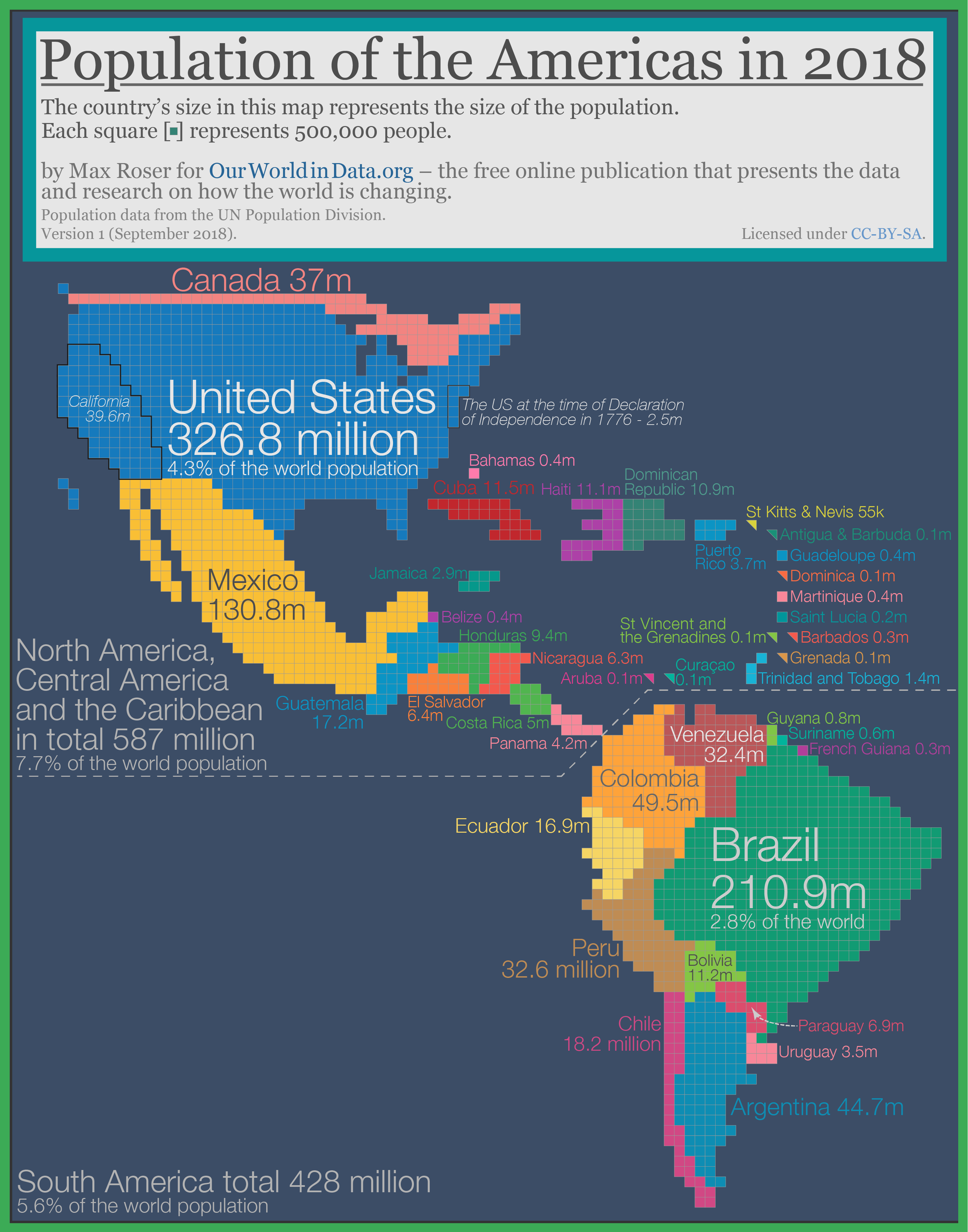
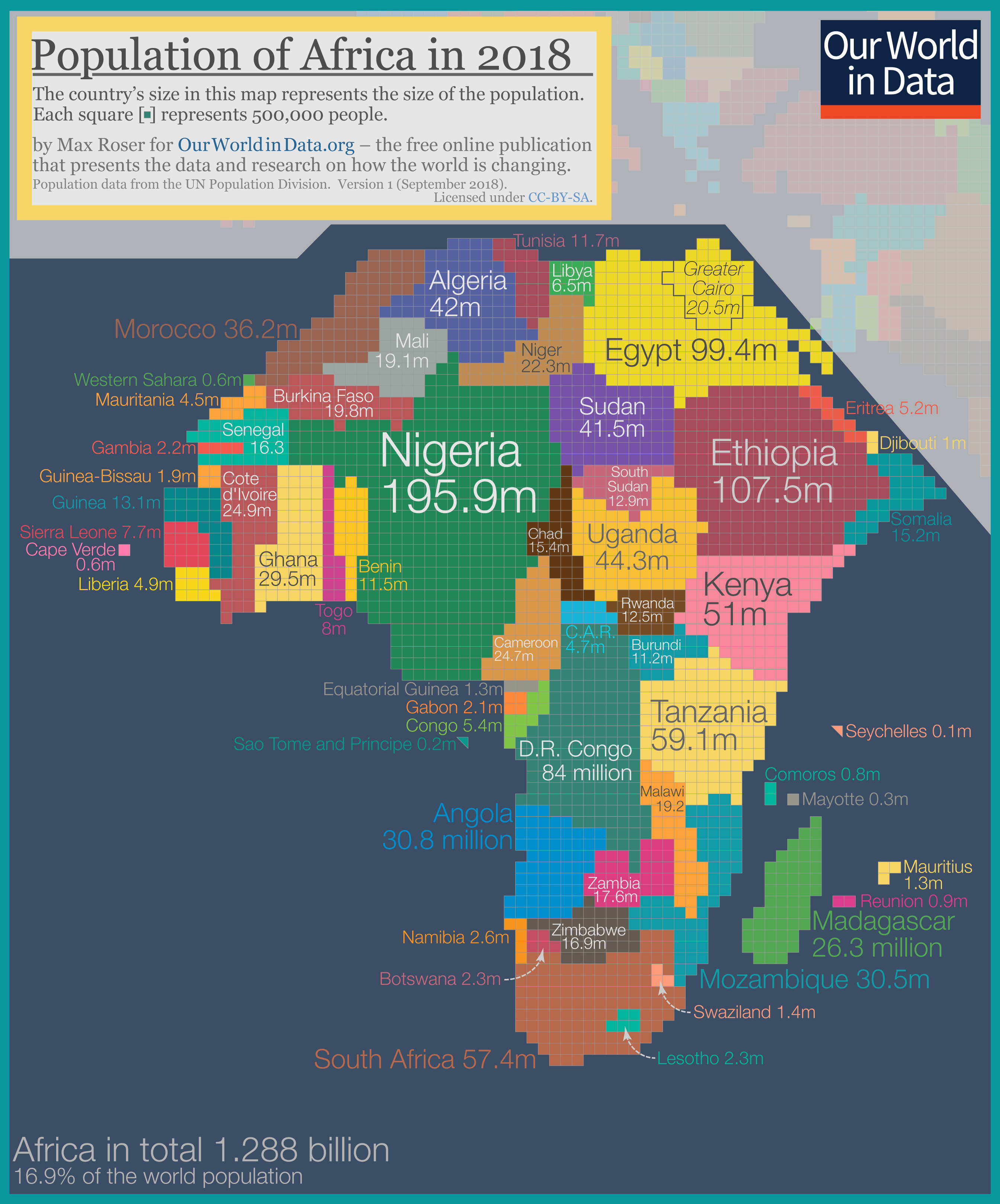
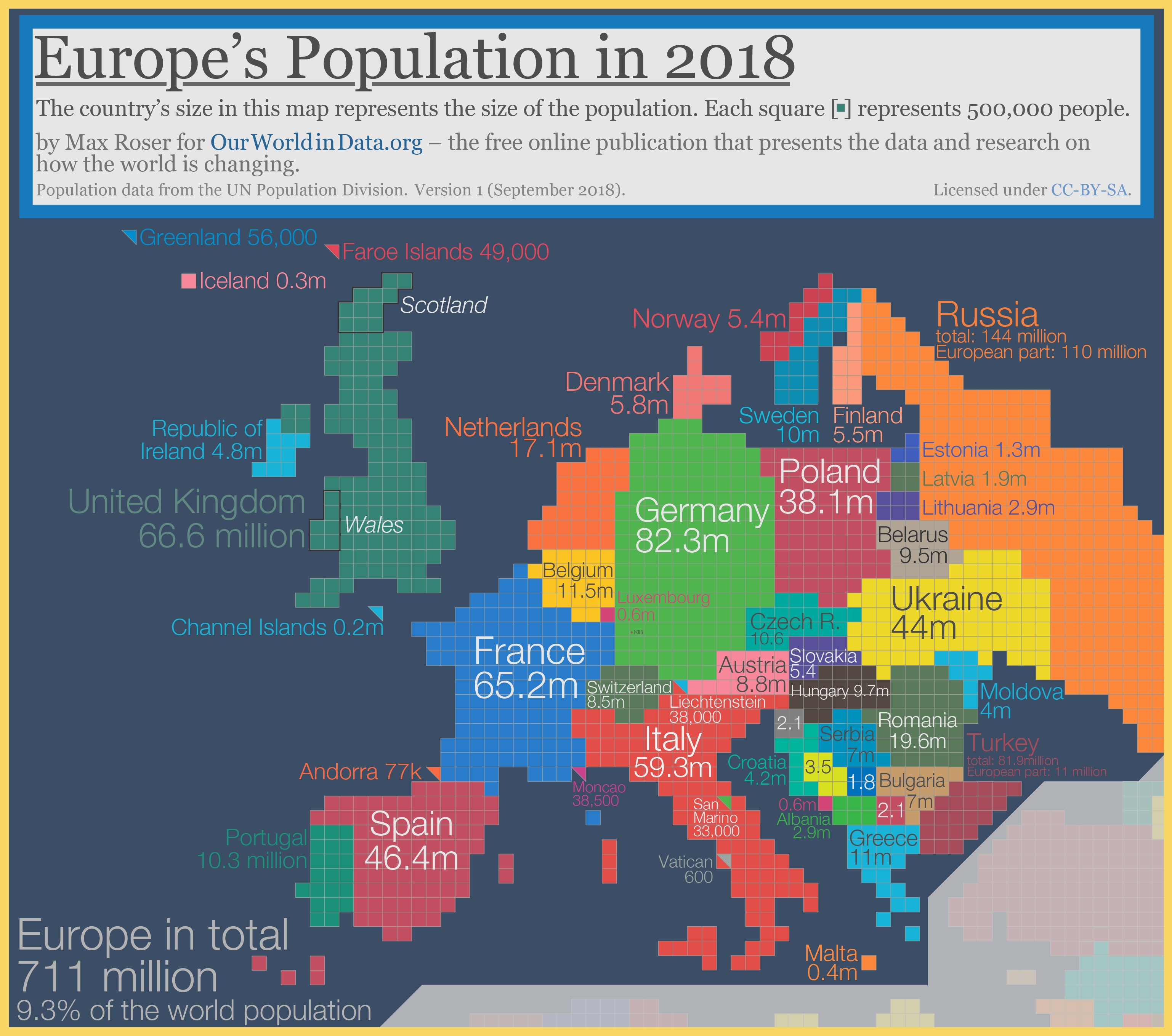
The following maps, from Our World in Data, show the world with countries’ sizes based not on their territory but on their population. By doing so, it provides perspective on the interesting divergences in population density around the world.
Perhaps the most obvious feature of these maps is the massive populations of China and India, which together are larger than the populations of any other continent that excludes them. Similarly out-sized are Japan, the Philippines, Indonesia, Bangladesh, Nigeria, and basically all of South East Asia. At the other end of the spectrum, despite being some of the largest countries in the world in terms of territory, Canada, Australia, and Russia have comparatively minuscule populations.
As Our World in Data notes:
“The area of Russia takes up 11% of the world’s land and the gigantic country borders both Norway and North Korea. But Russia is home to only less than 2% of the world population and is therefore shrunken in this cartogram to the size of Bangladesh, a country that is smaller than Florida.3“
“13 countries in the world are home to more than 100 million people: China (1.415 billion), India (1.354 billion), United States (326.8m), Indonesia (266.8m), Brazil (210.9m), Pakistan (200.8m), Nigeria (195.9m), Bangladesh (166.4m), Russia (144m), Mexico (130.8m), Japan (127.2m), Ethiopia (107.5m), Philippines (106.5m).
Together these 13 countries are the home of 4.75 billion people, 62% of the world population.”
All the details below come directly from Our World in Data. Enjoy:
Asia and Oceania
The cartogram below focusses on Asia and Oceania where 6 out of 10 people in the world live.
Within this world region the population is very unequally distributed. South-East Asia is densely populated while large countries such as Mongolia, Australia, Kazakhstan, and the Asian part of Russia are home to relatively few people. And again within countries we see a very high concentration. The metropolitan area of Beijing has the same population as all of Australia. Tokyo’s population almost equals the population of all of Oceania.
China and India are by far the most populous countries in the world. If you want to follow what is happening to the world you have to keep track of these two countries:
More than a third of the world population – 36.2% – live in India and China.
Today, both India and China have a larger population than the entire world population in 1850 (when the world population was around 1.26 billion people).
But while China and India dominate, other Asian countries are also very populous: Seven of the world’s 13 countries with more than 100 million inhabitants are in Asia.
Population growth in Asia has been rapid in the last decades: The population of Asia has tripled in size since 1950.
And while some countries in Asia have already reached the last stage of the demographic transition some others still have rapid population growth ahead. The fertility rate in India has fallen from 6 children per woman in the 1960s to 2.35 children today, but population momentum means that population growth will continue for another 4 decades. According to the UN’s population projection the population of India is expected to reach 1.68 billion in 2060 and the country is then expected to be the most populous country in the world.
The Americas
The population of the Americas is roughly one billion (1.015 billion). 428 million live in South America and 587 are at home in North America, Central America, and the Caribbean.
The USA – the third most populous country in the world – is by far the most populous country on the American continent. Its population is roughly as large as the population of the two runner-ups – Brazil and Mexico – combined.
Canada has a population density of just 4 people per km² – in the cartogram the second largest country in world (by area) is reduced to not much more than a slim line of squares.
The shape of the South American countries stays similar to what we would see on a geographical map. This is because the population density across the different South American countries is relatively similar.
The population of the American continent has increased very rapidly over the course of the last few generations. Historical estimates suggest that in 1820 the population was only around 35.5 million. At the time this made up just 3.4% of the world population.
Over the last two centuries the population growth rate in the Americas (28-fold) was much faster than in Europe (3-fold), Africa (14-fold), or Asia (6-fold).5
And some countries in the Americas had even faster population growth. The size of the US population in the 13 founding states at the time of Declaration of Independence, for example, is estimated to have been only 2.5 million.6
Africa
1-in-6 people in the world live in Africa. The second most-populous continent is home to almost 1.3 billion people.
Two countries have a population of more than 100 million: Nigeria with 195.9 million and Ethiopia with 107.5 million.
Population density varies hugely on the African continent. The largest African country is Algeria, but it is relatively sparsely populated. At the other end of the spectrum are Rwanda and Burundi. The two neighboring countries are densely populated and are both home to around 12 million people.7
Europe
711 million people live in Europe, less than 10% of the world population.8
Five European countries have a population that is larger than 50 million: The European part of Russia (110 million), Germany (82.3 m), the UK (66.6m), France (65.2), and Italy (59.3m).
Some regions of Europe are very densely populated. The Netherlands has a population density of 505 people per km² (compared, for example, to the US with 35 people per km² – see below for the map).
The population of China is almost exactly twice as large as the population of Europe.
While the population of Europe is small, the continent is economically very powerful and much richer than most other parts of the world. The per capita output and income of the Swedes for example is 30-fold higher than the per capita output and income of the Indians and 8-times higher than the per capita output or income of the Chinese.9
If you would like to be updated via email when we post a new article, please click here. It’s free and we won’t send any spam.
Submitted by Taps Coogan on the 30th of September 2018 to The Sounding Line.
As part of our ongoing series of historical video maps, we present ‘The Great Northern War,’ by YouTube Creator S&F Production. Beginning in 1700, the Great Northern War began when the Tsardom of Russia under Peter the Great attacked the Swedish Empire in a bid to gain regional supremacy and re-establish Russian access to the Baltic Sea. The initial Russia attack was defeated and Swedish forces subsequently invaded Russia, setting their sights on an assault on Moscow. Much like Napoleon and Hitler’s failed invasions of Russia in the following centuries, Swedish forces were hampered by the coldest winter in 500 years while in Russia. Swedish forces were badly defeated at the pivotal Battle of Poltava, turning the tide of the war solidly in favor of Russia and its allies. Russian forces ultimately won the war, establishing the city of Saint Petersburg with Russia becoming a major European power for the first time in history. The Battle of Poltava is considered to mark the beginning of the decline of Swedish Empire and the end of their status as a major European power.
Submitted by Taps Coogan on the 2nd of October 2018 to The Sounding Line.
The National Alliance Securities’ Andy Brenner recently spoke with CNBC’s Rick Santellito discuss what the new US-Mexico-Canada trade deal will mean for China.
“It puts a lot of pressure on China. Over the weekend we saw a continuing weakening in Chinese economic numbers and I think the Chinese are really starting to hurt here. So the President is winning the early battles of the war with China and I think that is very important… This will encourage the President to pursue his current China strategy.
Rick Santelli:
“…Many if the complaints, and rightfully so, were that it was a bit messy and if your goal as President, and this administration, was to isolate China, they could have done it more efficiently. In hindsight, as messy as it was, I think the pressure on China, considering both Mexico and Canada and to some extent Europe have capitulated, just raises the bar in ways that should be ‘advantage’ US…”
Andy Brenner:
“There is no question and this is coming at a bad time for China because their economy was slowing down anyway. Now I think (this) is going to just going to accelerate it and you are starting to see the Chinese ease, and change reserve requirements, and starting to put money in, and speed up infrastructure investment… The Chinese will slow walk (negotiations) until they see the results of the Midterms and then I think they will continue to slow walk it…”
If you would like to be updated via email when we post a new article, please click here. It’s free and we won’t send any spam.
Submitted by Taps Coogan on the 3rd of October 2018 to The Sounding Line.
The first couple of years following the Great Recession proved very formative in establishing the dominant market psychology that would persist throughout much of the current economic cycle. Those early years were marked by never-before-seen monetary stimulus from central banks who pledged to do everything and buy anything to reflate the asset bubbles that had burst. Those policies were met by snarky critiques from a slew of traders and bloggers who remarked that ‘you can’t fix a debt crisis with more debt’ and that ‘you can’t print your way to prosperity.’ Talking Bears and ‘The Bernanke’ explained the futility of trying to manipulate markets and of printing money. Nonetheless, asset prices marched higher. It was all part of the ‘New Normal.‘
While many distrusted an economic recovery built on monetary wizardry, there used to be a prevalent and useful resignation to the inevitability of asset price levitation. When its slogan was BTFD (language warning) and eventually BTFATH, websites like Zero Hedge had the pulse of the market, albeit cynically, and provided a useful framework within which to engage in a market that was likely to keep marching higher, regardless of the fundamentals.
When the Federal Reserve began to tighten monetary policy excruciatingly slowly in 2014, much of the snarky resignation to climbing asset prices turned into outright bearishness. After all, if the recovery was built on easy money, shouldn’t its removal signal the end of the recovery? The critics abandoned BTFD in favor of an endless cycle of doom and gloom that continues to this day.
Yet, as Rick Santelli once famously said: “all monetary stimulus is fungible,” and he was right. What critics missed was that while the Fed was tightening, the ECB and the BOJ were keeping interest rates at record negative levels and were still printing hundreds of billions of dollars a year. Meanwhile, the US economic recovery got on sounder footing thanks to tax cuts and a broad campaign of deregulation. While fewer were willing to say it, BTFD was still the only show in town.
Fast forward to today and the ECB and the BOJ are finally signalling a desire to tightening their monetary policy. The sum of global central bank balance sheets is expected to begin shrinking by the end of the year. As such, BTFD finally seems to ring hollow. Its raison d’etre, fungible central bank stimulus, is finally receding at a global level.
And yet US markets keep marching higher (though only US markets), seemingly oblivious to all the growing problems in the world, just as they have been for the past decade. Perhaps that is the power of even a modest dose of structural economic reform. Perhaps it is capital flight to the US and the last vestiges of ECB and BOJ stimulus. The one thing that is clear is that today’s diverging markets do not resemble the BTFD world of just a year ago.
A new market psychology is needed.
For all the discussion about the wealth divide, oceans of debt, and the zombie corporations that QE and ZIRP created, it also undisputedly succeeded in driving up asset prices.
Whenever markets start to get really dicey again, the main thing that central banks will remember about QE is not the wealth divide or other ‘second order’ concerns but the fact that it succeeded in reflating asset bubbles. So while central banks are unlikely to reverse tightening for any run-of-the-mill market ‘dip,’ you can bet at least some of them will dust off the printing presses for a bone-afide market panic or recession.
So while bad news may finally be bad news again, very bad news may very well be the best news of all for markets. Until very bad news arrives, the market is going to have to fend for itself for the first time in a decade.
Out with BTFD and in with BTFR (Recession), aka ‘be cautious until things get really bad.’
If you would like to be updated via email when we post a new article, please click here. It’s free and we won’t send any spam.
Submitted by Taps Coogan on the 4th of October 2018 to The Sounding Line.
Wolf Richter, creator of the website Wolfstreet.com, recently gave a wide ranging interview in which he discusses the impact of rising tariffs and warns about the risks of rising mortgage rates on housing markets in the US and Canada.
Wolf Richter on rising tariffs:
“Tariffs are on… profit margin… They are not a tax on consumers because companies already charge the maximum prices in the United States that they can get away with. Prices are determined by market forces. They are not determined by cost and market forces are such that if GM wanted to slap a $5,000 price on a vehicle that is (tariffed) that it imports from Mexico, consumers would just laugh. GM already can’t sell its cars without big rebates. They are charging the maximum amount they can in order to produce the sales that they want. So those tariffs can’t be passed on the consumers, largely. They will be eaten by companies that got a huge tax cut already. So now they are getting a little bit of a tax increase and they should just stop squealing as far as I am concerned…”
On the housing markets in the US and Canada:
“In terms of housing in the United States and Canada, there are some big differences. In both countries we have cities with major housing bubbles… The housing bubbles in Canada are probably more significant than they are in some of the cities in the United States… In the United States the standard mortgage is a 30-year fixed rate. So when you buy a home today.., your interest rate does not change for the next (30) years, even though interest rates might be higher, right now the average is about 5% already, you will never have to worry about that interest rate rising (with a fixed rate mortgage). So you can budget for that… This protects consumers somewhat. In Canada, you have adjustable rate mortgages and variable rate mortgages that dominate. So many mortgages adjust almost instantly to rate increases and then there are other mortgages where you have a fixed rate for five years and then they adjust. So higher interest rates impact existing home owners in Canada. They don’t really impact existing home owners in the United States. So new home owners in the United States have to deal with higher rates… So they have to look for cheaper homes or they are locked out the market entirely… Now in Canada the problem is with existing home owners. You have to keep in mind that when we went through our mortgage crisis here (in the US), a big part of the problem were home owners with adjustable rate mortgages. When mortgages reset to higher rates they couldn’t afford those payments… These adjustable rates mortgages, in an environment of rising interest rates are deadly and they are deadly for existing home owners… This is something that Canadian home owners will have to struggle with.”
There is much much more so enjoy the interview above.
P.S. If you would like to be updated via email when we post a new article, please click here. It’s free and we won’t send any spam.
Submitted by Taps Coogan on the 5th of October 2018 to The Sounding Line.
Louis-Vincent Gave, co-founder of Gavekal Research, recently spoke with Erik Townsend’s Macro Voices in a wide ranging interview about the sell-off of emerging markets, the US Dollar, China, and much more.
Mr. Gave on the US-China trade dispute:
“I think if you spend anytime in Washington, if you talk to journalists, or policy makers, or bureaucrats, there is a uniformity of views that really I haven’t seen since October of 2016 when everyone was dead-convinced that Hillary Clinton was going to win. Today, everybody is dead-convinced that China is on the verge of imploding, that basically all the US needs to do is push a little bit and China, economically, will implode. It’s a house of cards built on debt, not creating enough value, etc… You know the whole story, and I think part of the problem is everything that has happened in the past five months will have reinforced that view, in that the US starts talking tough against China, the Chinese stock market starts going down 20%, the US stock market goes up 12%, and this will have reinforced the view of everybody in Washington that China is… really in deep economic trouble. Now of course, a 20% drop in the Chinese stock market is neither here-nor-there. It’s especially neither here-nor-there for Chinese policy markers. That kind of thing happens all the time. But most importantly, it doesn’t really matter because very few Chinese corporates actually fund themselves or their growth on equities. They mostly fund themselves through bank credit. So the view in the US is that China is about to implode. Meanwhile if you go to Beijing, the view is that the US is more politically divided than its ever been and that, as such, the US is really incapable of taking any kind of economic pain. That if and when the next recession comes, the political bickering that will unfold in the US will just basically tear society apart. I am not saying that this is true. I am saying that this is… the prevalent view in China… This is the worst possible of setup for any kind of negotiations… If you and I need to strike a deal on whatever and if we’re both convinced that each one of us has all the cards and that the other guy has none of the cards, then we are very unlikely to compromise on anything. So I think the view in China is ‘we don’t need to compromise because we can wear economic pain. If and when the next global recession comes, we will wear it…’ Meanwhile the view in the US is that if and when the next recession comes, China is going to completely implode. Now of these two things, perhaps because I spend more time there, I am more inclined to the Chinese view.”
There is much more to the interview, so enjoy it above.
P.S. If you would like to be updated via email when we post a new article, please click here. It’s free and we won’t send any spam.